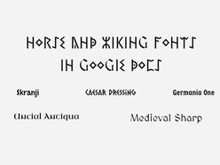
When working on documents in Google Docs, you might find yourself in a situation where you need to fit a lot of content into a limited space. Whether it’s an essay, a report, or a project brief, choosing the right font can help optimize the available space without compromising readability. Below, you’ll find the top 5 compact fonts listed, along with images for each, so you can easily evaluate how they look and assess their level of condensing.
1. BenchNine
BenchNine is known for its ultra-slim letters, making it ideal for fitting large amounts of text into a small area. It works best for short headings or minimal text due to its condensed style but might not be suitable for longer passages.
2. Homenaje
Homenaje is a compact sans-serif font that excels in titles or short passages. While it’s readable, it’s not the best option for extensive content due to its narrow design.
3. PT Sans Narrow
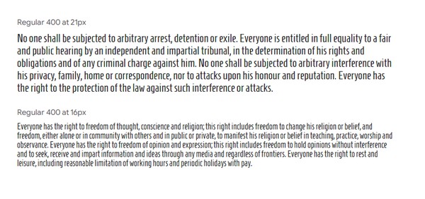
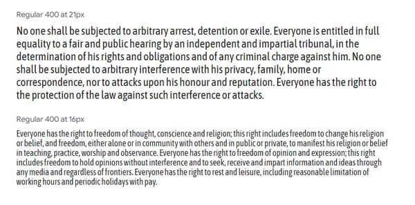
PT Sans Narrow offers a professional and clean look. It’s a great choice for both headings and body text, maintaining excellent readability while saving space.
4. Asap Condensed
Asap Condensed combines space efficiency with modern aesthetics. It works well for both professional documents and creative projects, providing legibility even at smaller sizes.
5. Cabin Condensed
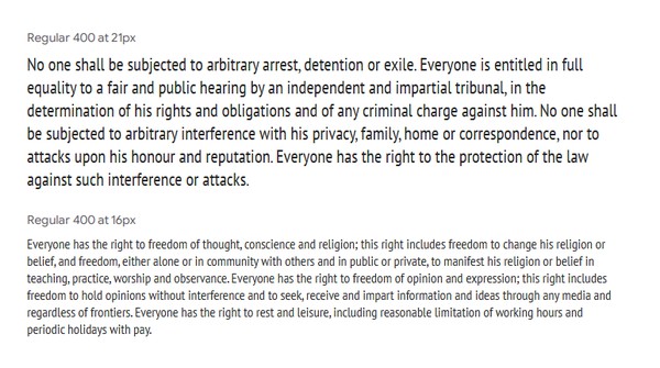
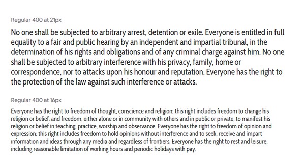
Cabin Condensed is another versatile option. Its sleek design ensures that text remains clear and easy to read, making it suitable for long-form content.
Practical Considerations
When choosing a smaller font, keep these factors in mind:
Readability: Fonts like PT Sans Narrow and Cabin Condensed are better for long-form text because they maintain clarity even at smaller sizes.
Purpose: Consider your audience and the document’s purpose. For example, an academic paper or professional report should adhere to standard formatting guidelines, which typically specify fonts like Times New Roman or Arial at 12 points.
Legibility at Smaller Sizes: Fonts like BenchNine and Homenaje may look appealing for saving space, but they can become illegible when scaled down too much. Test your document by printing or viewing it on different devices.
Accessibility: If your document will be shared digitally, ensure that readers with visual impairments can easily read the text. Avoid excessively small sizes and opt for accessible formatting tools.
Tips for Fitting More Content
If you’re struggling to fit your content without resorting to extremely small fonts, try these alternatives:
Adjust Margins and Line Spacing: Reducing margins and slightly tightening line spacing can save space without affecting readability.
Use Columns: For certain types of documents, such as newsletters or brochures, dividing text into columns can optimize space.
Edit for Conciseness: Review your content to eliminate unnecessary words or redundant phrases.
Leverage Lists: Bullet points or numbered lists often take up less space than full paragraphs while improving readability.
Avoiding Common Pitfalls
Breaking Formatting Rules: For formal documents, always check guidelines. Substituting standard fonts with smaller alternatives might result in penalties or negative impressions.
Sacrificing Readability: Don’t prioritize space savings over clarity. Even the smallest fonts should remain easy to read.
Overloading a Page: Instead of cramming too much content onto one page, consider breaking your document into multiple pages or sections.
Choosing the smallest font in Google Docs is not just about space efficiency — it’s about presenting your content in a way that is both practical and visually appealing. Fonts like PT Sans Narrow and Cabin Condensed offer a good balance of compactness and legibility, while others like BenchNine and Homenaje are best for specific uses.